Last Updated: August 13, 2024
Today, I want to show you how to add cool effects to text in Adobe Illustrator because firstly, it’s so much fun (well, I think so) and secondly, it adds so much more pazazz to the simplest of designs.
Dressing your text up with different effects is a great way to make your designs more eye-catching and stand out amongst the masses. Adobe Illustrator is awesome for creating all sorts of designs and text designs are no exception.
What’s even better is that these effects are super easy and quick to create so, let’s get straight into this and learn how to take our text designs from mundane to magnificent in mere minutes.
How To Add Cool Effects To Text In Adobe Illustrator
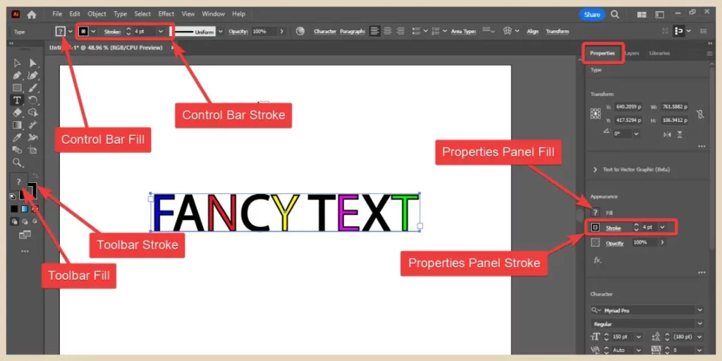
The simplest way to dress up your text is by adding a splash of colour to it. You can change all your text in one go or you can highlight individual words or letters with your cursor and change their colours separately using any of the fill icons on the Toolbar, Properties panel or Control bar/Options bar.
You can do the same thing with the stroke (border) colour and thickness from the same areas and again you can apply it to the whole text or highlight individual words/letters to add different stoke effects to jazz things up a little.
For the most part, you can choose any colour here, however, gradient colours work slightly differently with text and you’ll need to do things a little differently if you want to add a gradient effect.
Adding A Gradient Colour Effect To Text
Now you would think that this would be a simple enough thing to do and in reality, it is but you need to do it in a particular way in order for it to work.
For example, if you just changed the current fill colour to a gradient colour, you would see it selected on all the fill icons but it wouldn’t be showing on your text just like the screenshot below.
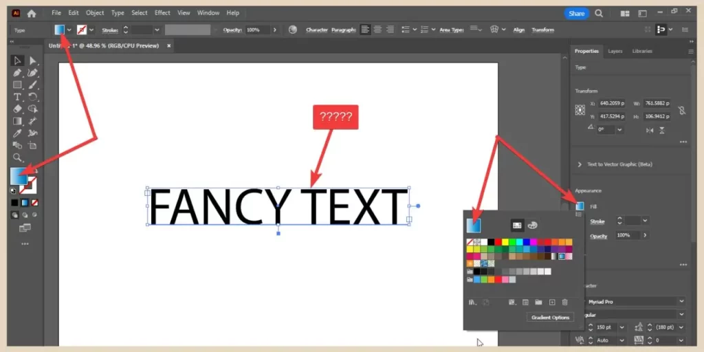
To get this to work correctly, you’ll need to get rid of the current fill and then add a brand new fill to the text to add your gradient.
To do that, simply select your text with the selection tool and choose no fill (the white box with the red line going through it) from any of the fill icons on the Toolbar, Control bar or Properties panel.
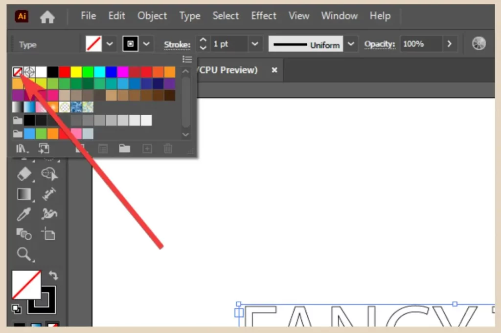
If you don’t have a stroke applied to your text, you’ll no longer be able to see it but don’t worry, it’s still there.
Adding A New Fill
Next, open up the Appearance panel by either clicking on the three dots in the bottom right corner of the Appearance section on the Properties panel or by clicking the Window menu followed by the Appearance option.
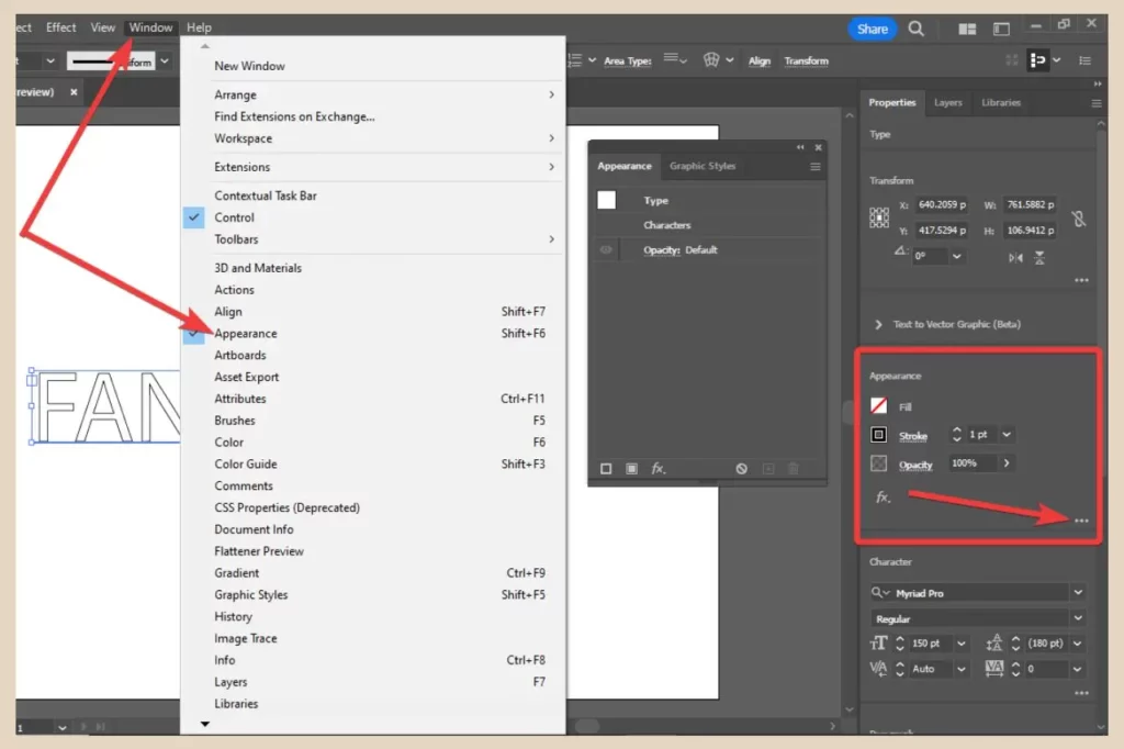
Once the Appearance panel is open, click on the Add New Fill icon (the square with the white fill) at the bottom of the panel and a brand new fill will be added to your text.
Just make sure you select the text with the selection tool and not the text tool otherwise the Add New Fill icon will be shaded out and unclickable.
From here you can now choose a gradient colour and this time it will be applied to your text. You will lose any stroke colour you had applied to it but you can simply just reapply it again afterwards.
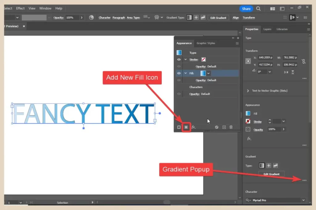
To edit this gradient and make it unique, you can open up the Gradient popup panel by clicking on the three dots in the bottom right corner of the gradient area on the Properties panel. You can also open the Gradient panel from the Window menu as I’ve done for this example.
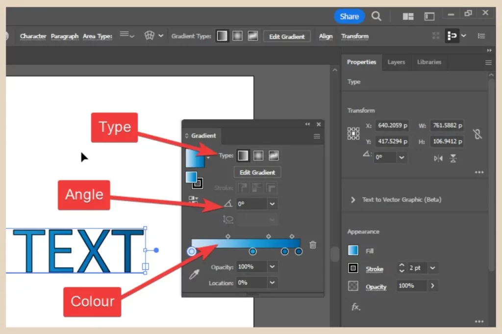
You can make several different customisations here including the gradient type, gradient angle and the gradient colour. The gradient colour in particular can be changed in several different ways.
Changing, Adding Or Deleting The Gradient Colours
To simply change the colours, double-click on any colour stop (the coloured circles) beneath the gradient slider and colour options will appear where you can change that particular colour.
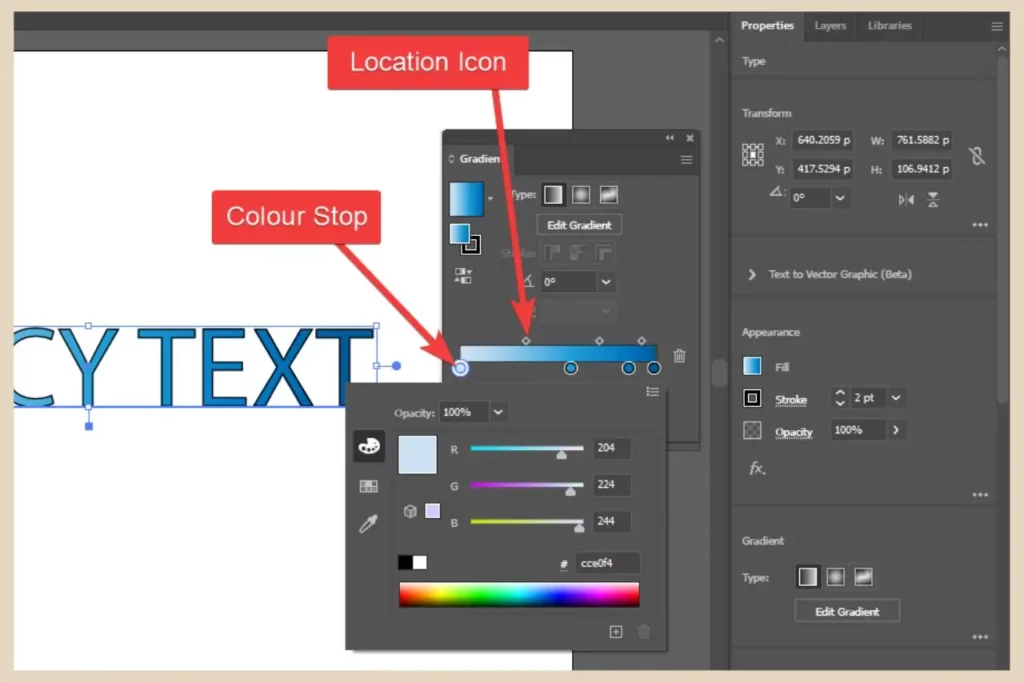
To remove a colour, you can either click and drag its colour stop away from the slider or you can click it once to select it and then click the trash can icon to the right of the slider to delete it.
You can also click and drag the colour stops across the slider to change their position or click and drag the location icons on the top of the slider to adjust where the colours blend into each other.
If you want to add more colours to the gradient, hover your cursor just below the slider until a small + appears with it. Once you see this, click to place a brand new colour stop on the slider.
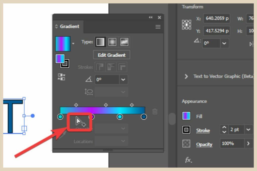
You can add as many colours as you like to the slider and adjust them all using the methods above to create your own customised gradients for your text.
Adding Graphics Styles To Your Text
You can also use graphic styles to fill your text and you’ll find a small number of these on your colour palette when you click on any of the fill icons.
There’s also a Graphic Styles panel which you can open from the Window menu (it also opens with the Appearance panel).
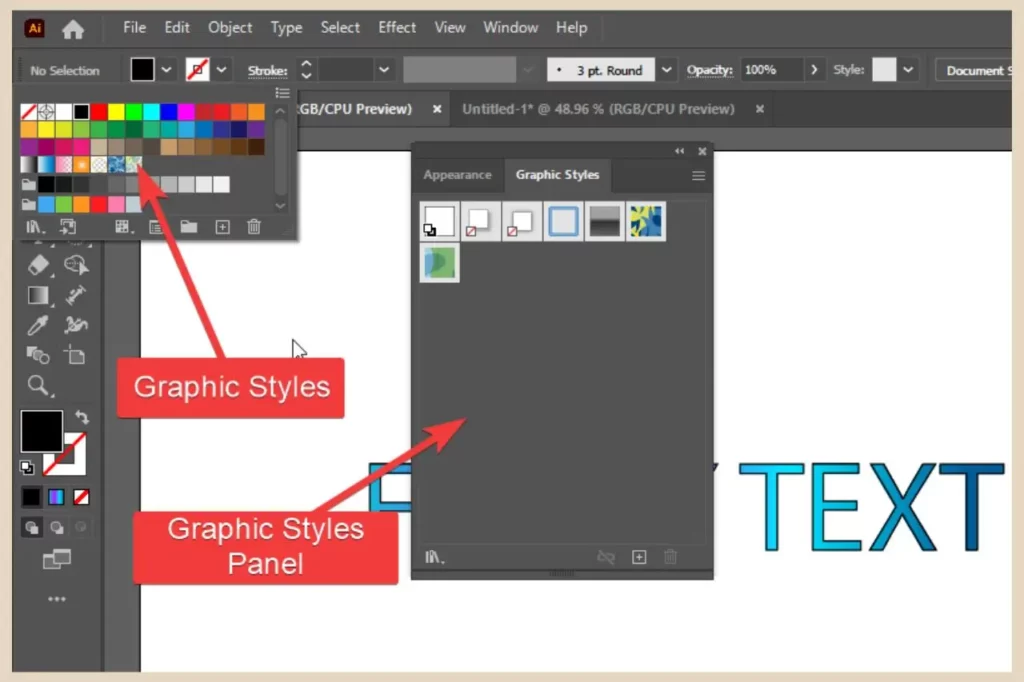
Unfortunately, there isn’t a big selection here but there are Graphic Style libraries which contain far more options.
Accessing The Graphic Style Libraries
To access them, click the Window menu and click the small black arrow at the bottom to scroll down until you see the Graphic Style Libraries option.
Hover over the option to show a flyout menu which will contain various Graphic Style Libraries for you to choose from.
Alternatively, you can click on the Graphic Style Libraries icon in the bottom left corner of the Graphic Styles panel to access the same flyout menu.
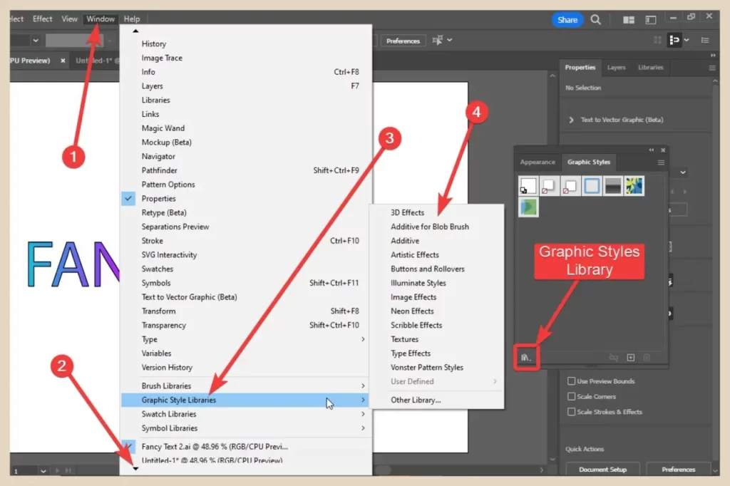
For this example, I’m going to use the Artistic Effects library but selecting any one of these will open up another panel with a selection of that library’s graphics styles for you to choose from.
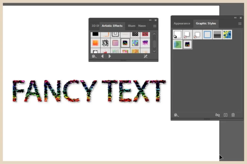
As you can see from the screenshot above, there are some pretty cool graphic styles that you can use to really jazzy up your text designs.
Adding Effects From The Effect Menu
Let’s move on to something a little more eye-catching shall we and add some of the built-in Illustrator effects (vector effects) from the Effect menu.
There are a lot of different effects that you can add here, in fact, way too many for me to cover all of them but let’s have a look at some of the coolest ones.
advertisement
However, do note that some graphic styles and effects can’t be used together so you may need to play around here to see what works with what.
Adding 3D And Material Effects To Text
We’ll start with 3D and Material effects so select your text on the artboard and then click Effect from the main menu. Next, hover over 3D and Materials to show the flyout menu and select the effect you’d like to add.
Selecting any one of the first five options will open up the 3D and Materials panel although you can also access it from the Window menu.
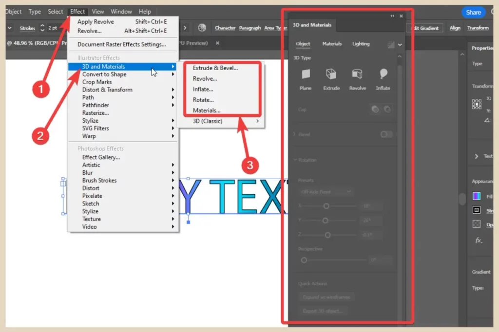
The last one (3D Classic) is the classic version of the tool and will open up in a small window rather than the new panel.
From the panel, you can make several adjustments to the effect using the different sliders. You can also change the effect using the 3D Type options near the top of the panel. In the screenshot below, I’ve used the Extrude effect.
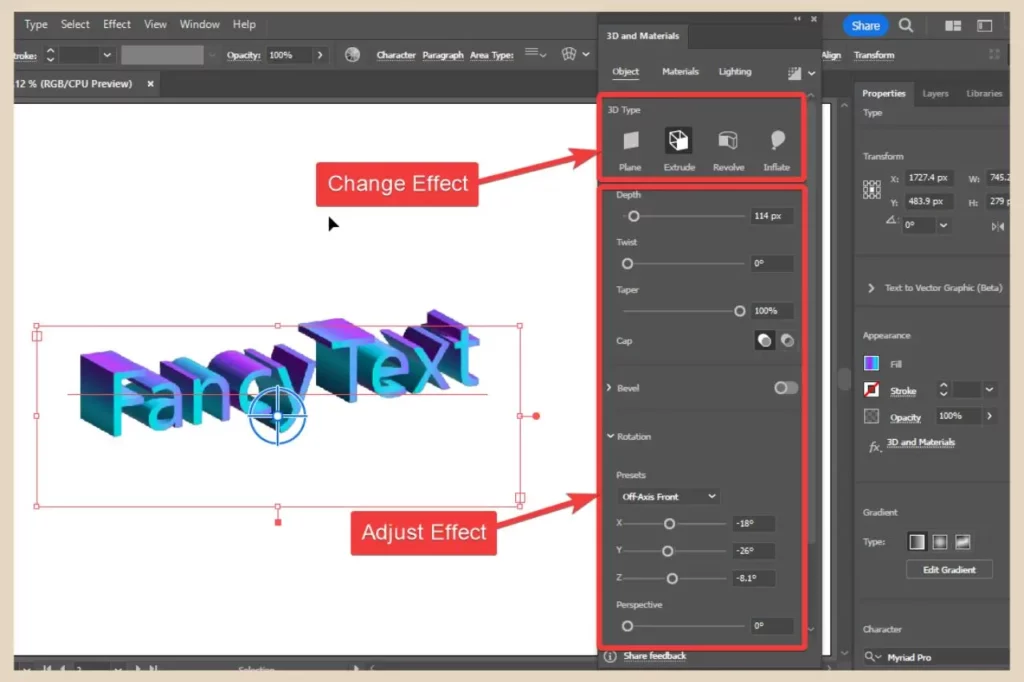
You’ll also notice some extra tabs along the top of the panel where you can add material styles to your design or change lighting options.
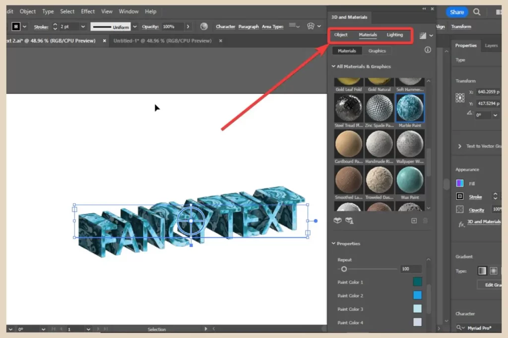
Both tabs will also have adjustment options at the bottom so you can customise any material or lighting effects that you’ve added to your design. Do note though that adding a material style will replace the fill you currently have.
Using Distort & Transform
Another set of cool effects that you can add from the Effect menu are the Distort & Transform effects. Hovering over the Distort & Transform option will open a flyout menu where you’ll have a few different effects to choose from.
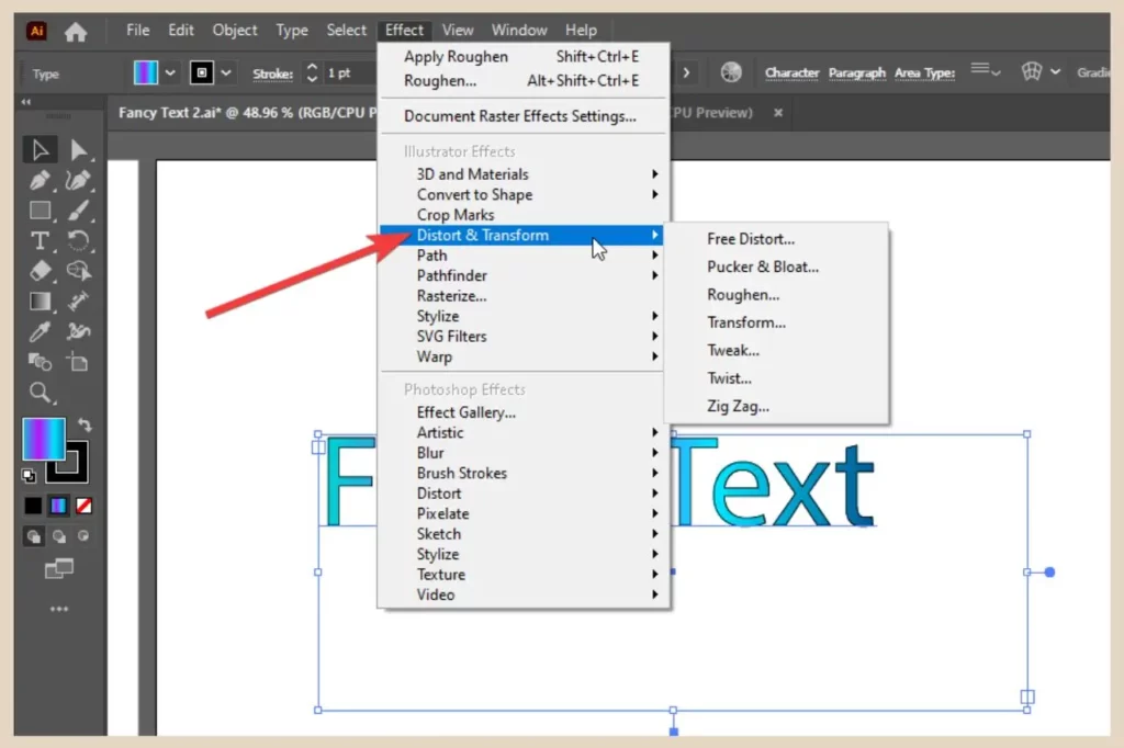
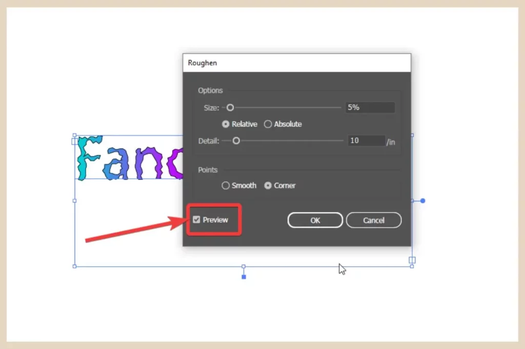
Simply select one and a small window will open where you’ll be able to make adjustments to the effect before clicking the OK button to add it. Just make sure that the Preview checkbox is ticked so that you can see all the adjustments as you make them.
Below is a screenshot of a few of the effects from the Distort & Transform options that you can add to your text to snazzy it up.
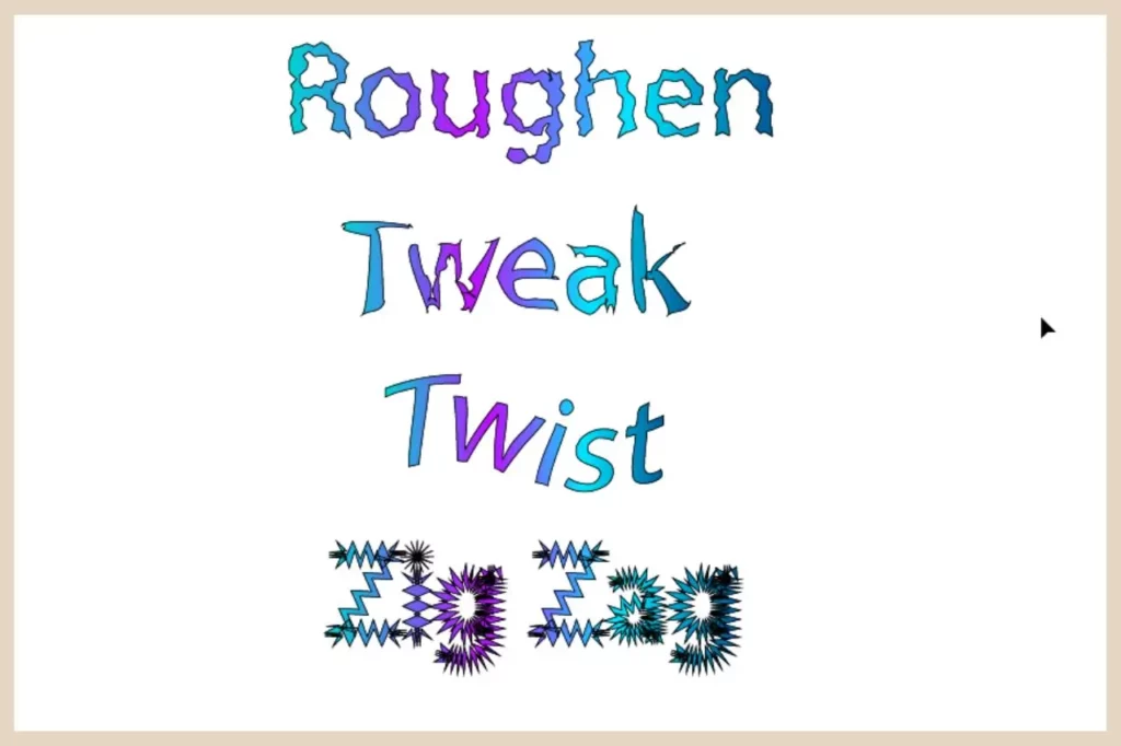
As you can see, there are some pretty interesting effects here that you can use to create really unique text designs.
Using Stylize
The Stylize option is another popular choice from the Effect menu. This is the home of effects such as the Drop Shadow effect and the Outer Glow effect.
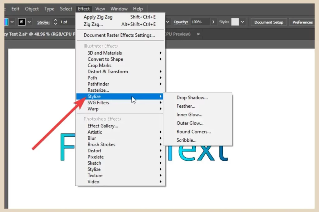
Again, hover over it to show the flyout menu and click on any one of the effects to add it to your text.
Much like the Distort options, a new window will appear where you can make several adjustments to customise the effect even further before confirming it, however, these adjustment options will vary depending on the effect selected.
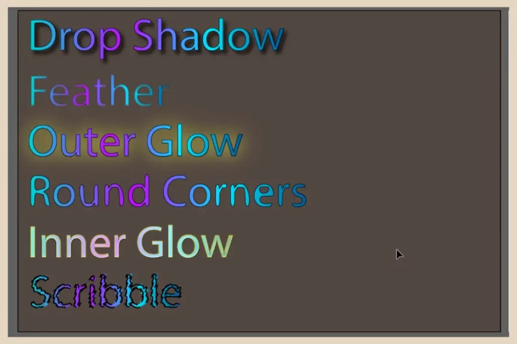
The screenshot above is an example of all six Stylize options but they can all be altered to change the intensity of the effects.
Using SVG Filters
SVG Filters are nice quick effects that you add with one click. You won’t be able to make any adjustments to them like the previous effects but they’re still pretty cool nonetheless.
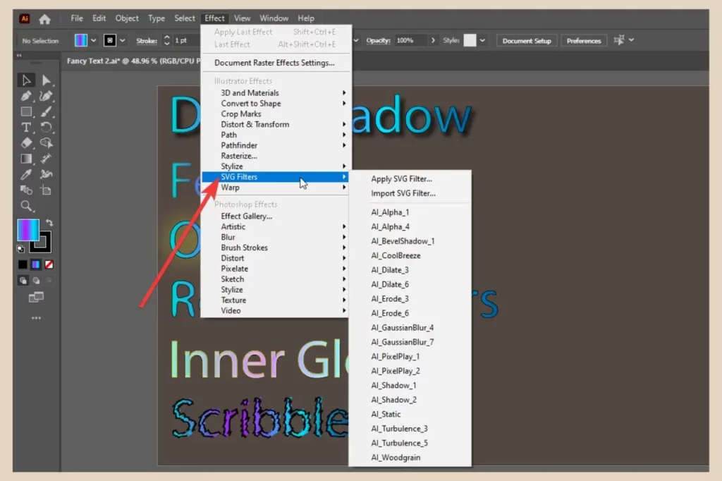
Again, click on Effect from the main menu and hover over SVG Filters to show the flyout menu. From here, simply click any of the filters and they will be applied instantly to your selected text.
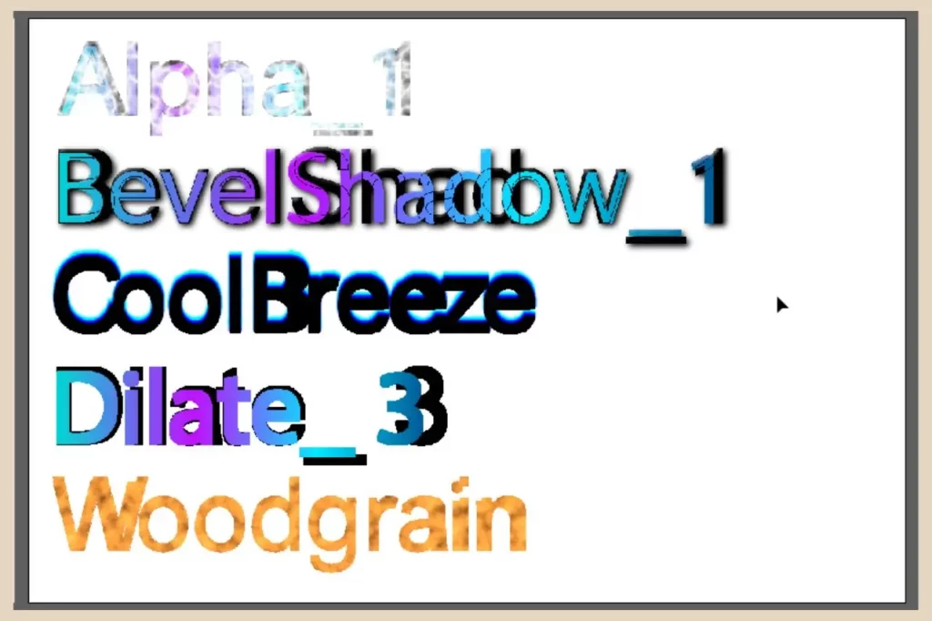
The above screenshot is a quick example of just some of the filters you can add to your text to spruce up its appearance.
Using Warp Options
The Warp options are another great effect that you can add to your text and I personally love using these. Much like many of the previous effects, these can be adjusted to alter their effect.
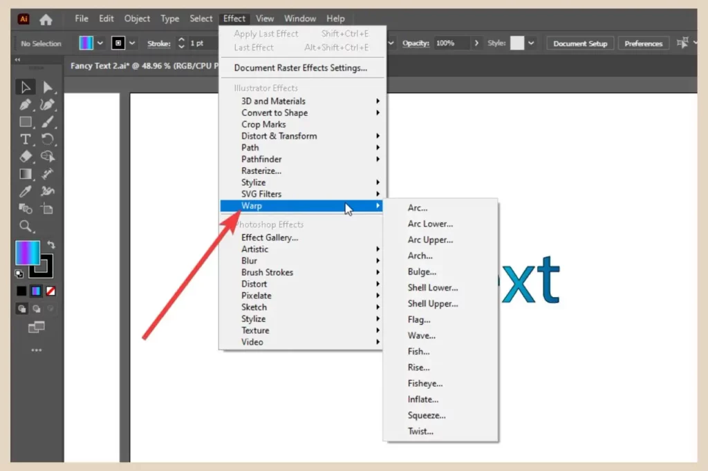
So, click the Effect menu and hover over Warp, then click on any of the effects from the flyout menu to open up a small options window.
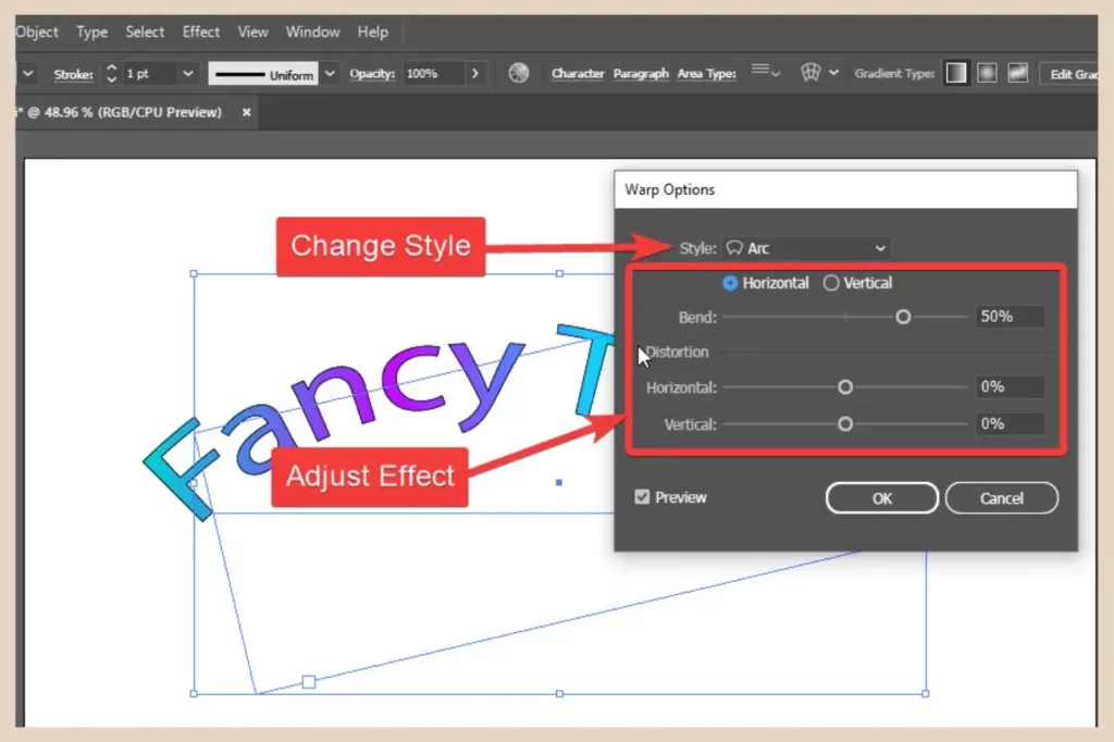
Regardless of what warp effect you selected to open the window, you can easily switch to one of the others using the Style dropdown menu which includes all the same styles as the the Warp flyout menu.
You can also use the sliders to adjust the effect or change it from horizontal to vertical. As long as the Preview checkbox is ticked, you’ll be able to see all the changes as you make them. Once you’re happy with the effect, click the OK button to apply it.
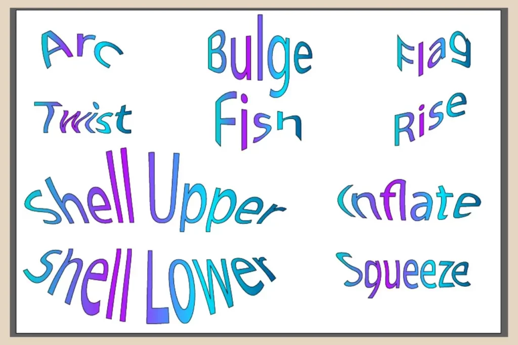
Again, as you can see in the screenshot above, there are some pretty cool warp effects that you can add to your text and you can really customise these to make them much more unique.
Adding Photoshop Effects To Text
You’ll also notice some Photoshop effects (raster effects) in the Effect menu and you can use these too. You can either hover over each option and select an effect from the flyout menu or you can click on Effect Gallery at the top of the list.
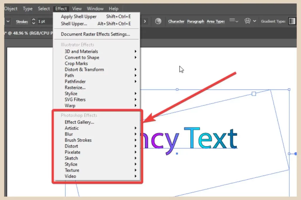
Either way will open up the effects window where you can switch between effects using the dropdown menus and make adjustments to the effects using the area on the far right of the window.
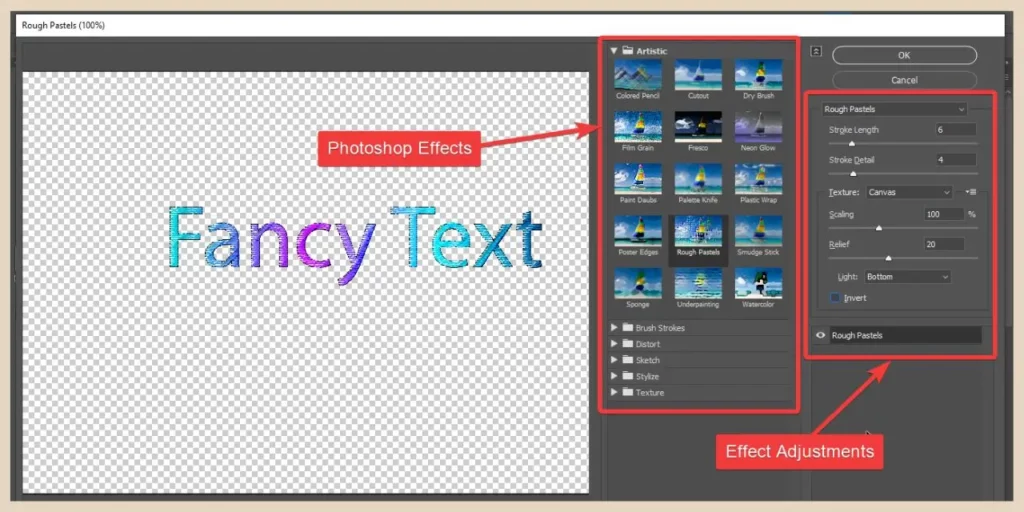
You’ll see a preview on the left of the window of any effects you add and once you’re happy with the results, click the OK button in the top right of the window to apply them.
Converting Your Text Into Graphics
Another way to create interesting effects is to convert your text into graphics. This essentially means that you’re turning every single letter into an individual object.
Unfortunately, your text will no longer be editable once it’s converted so make sure there are no typos before you do it. However, once converted, you’ll be able to alter the appearance and add different effects to each letter individually.
To do that, select your text and then click Type from the main menu. Next, click Create Outlines from the menu options and your text will now be converted into graphics.
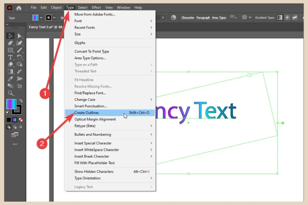
This will turn all the letters into a group of individual objects which you’ll now notice in your layers panel just like the screenshot below.
Making Changes To Your Converted Graphics
You’ll now be able to select each letter individually by double-clicking on it (to isolate it from the group) or by selecting it in the layers panel.
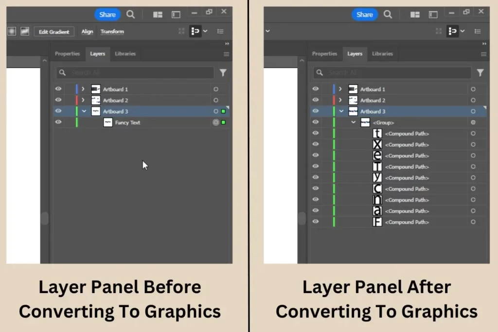
If you prefer, you can ungroup all the letters (Object menu, Ungroup) so that you can select them with a single click. This will, however, remove any effects, fill and stroke you currently have applied to the text.
The great thing about converting your text into graphics is that you can work on each letter independently without affecting any of the others. This includes moving, reshaping, resizing and adding different effects to them.
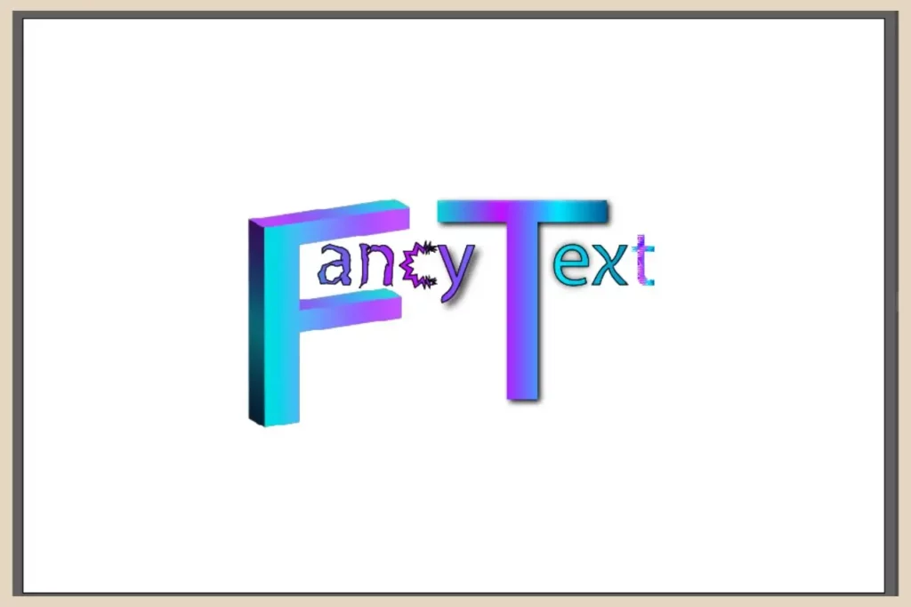
In the example in the screenshot above, I’ve reshaped and resized different letters and added a different effect to each one so there’s a lot you can do here when each letter is an individual object.
Let’s Get Effect Adding
As you’ve seen, there are many ways to jazz up your text in Adobe Illustrator and adding effects to it is just one of them.
If you feel like getting even niftier with your text designs then have a look at my other tutorial on filling your text with an image or maybe you’d like to learn how to fill a shape with text so that the text mimics the shape.
Either way, have fun playing around with your text designs and if you get stuck or just feel like sharing your own text design stories, then please feel free to let me know in the comments below.
Happy Effects Adding!

You May Also Like
- How To Draw Behind Or Inside Objects In Adobe Illustrator
- How To Create The Ultimate Gradients In Adobe Illustrator
- How To Add Cool Effects To Text In Adobe Illustrator


