Last Updated: July 22, 2023
If you want to learn how to create a button in WordPress, then look no further because that’s exactly what I’m about to cover in this post.
Adding a button in WordPress is actually a very simple task and although you can use plugins for this task, WordPress does have its own button block already built in and that’s what I’ll be showing you in this post.
I’ll show you how to add one button or a horizontal line of multiple buttons, how to add links to a button and how to customise a button to make it look more unique.
BTW, if you’re looking to add social share/follow buttons then check out this tutorial instead as it’s far better to use a social share plugin for that task.
But otherwise, without further ado, let’s get straight into this and start creating some buttons.
How To Create A Button In WordPress
To start, you’ll need to head to the post/page where you liked to add a button. Once there, decide where you’d like to place your button and click on the + icon to add a new block.
When the small window appears, type Buttons into the search box. When the Buttons block appears, click on it to add it to the area.
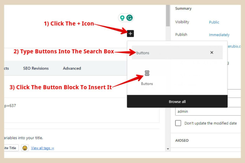
This will add a basic button to the post where you can now add your own text of choice. As long as the button is selected, a cursor should be flashing inside the button so you can go ahead and type your text in.
You’ll also notice a small format box above the button block that will allow you to make a few changes to both the button and the text.
The three buttons as per the image below will let you change the different alignments of the button.
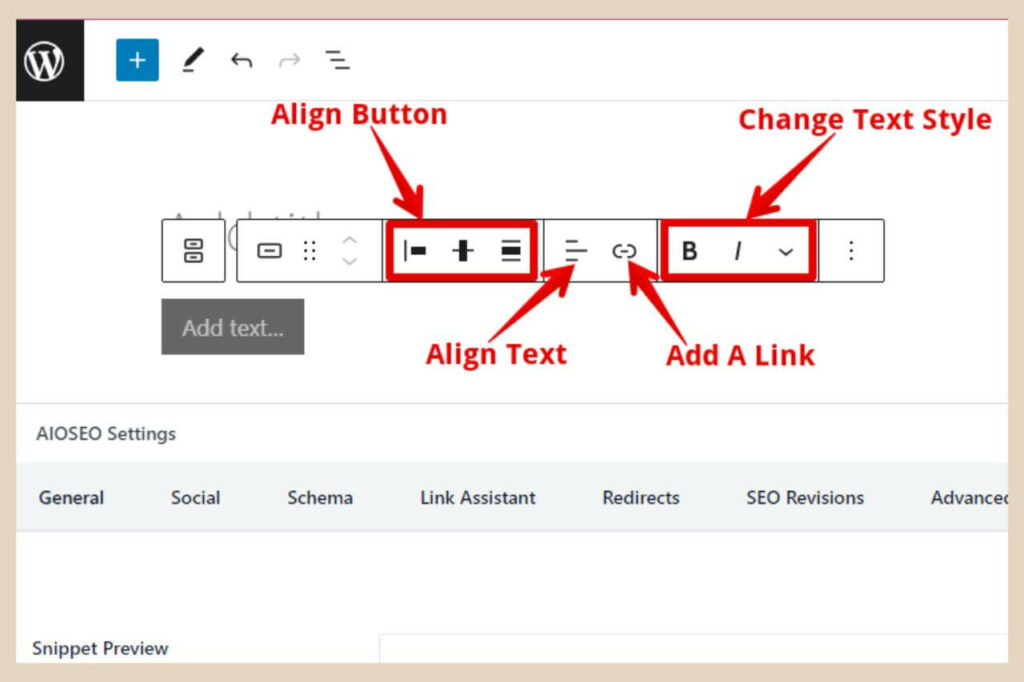
The next two buttons will allow you to align the text within the button or add a link to the button (more on how to do that shortly).
The last three buttons will allow you to change the text style slightly although the third button (the dropdown arrow), I’ll come back to later because there is an option here to add icons/images to your button.
Making Bigger Changes To Your Button
To make bigger changes to your button, you can use the block settings on the right of the page which should be there by default.
If you’re not seeing these settings, then click the Settings button on the top right of the page next to the Publish/Update button and make sure that Block is selected at the top of the settings.
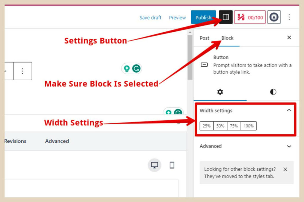
The very first thing you can do here is change the width of the button. To do this, you can use the percentage buttons under Width Settings. If you leave the button as is, it will resize itself to fit the text that you place within it.
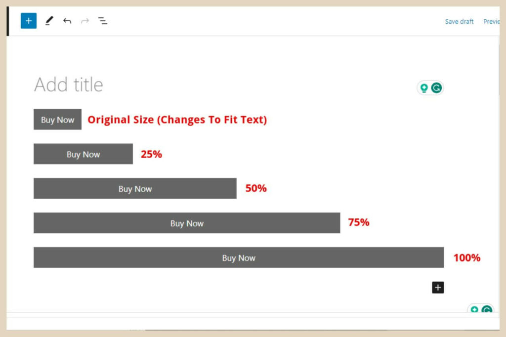
If you use any of the percentage options it will resize the button to that percentage of the content area in which it’s placed as per the examples in the image above.
Changing The Style Of The Button
To change the style of the button, you’ll need to click the half-coloured circle to the right of the cog wheel above the Width Settings section. This will show you a new area where you can do a lot more to customise your button.
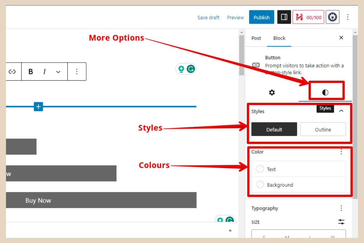
The first option here is Styles and you’ll be able to choose between two different types. The first one is the Default style which is a button with a coloured background that will change to a darker shade when hovered over.
The second type is the Outline style which is a button with no coloured background behind it that will change to the default dark grey when hovered over.
Changing The Colour Of Your Button And The Text Within It
The next section underneath this is the Colour section where you can change the colour of both the button and the text within it. To change the text colour, simply click on the Text button and a small colour window will appear.
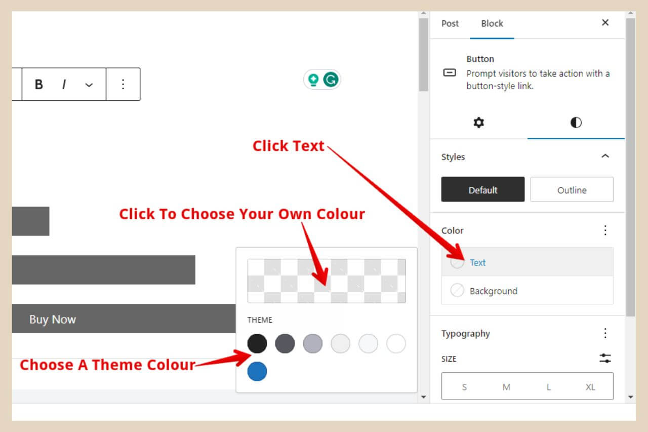
From here, you’ll have a small selection of colours based on your theme but if you click on the checkered colour box, this will open up a new window where you can use the sliders to pick a colour of your choice.
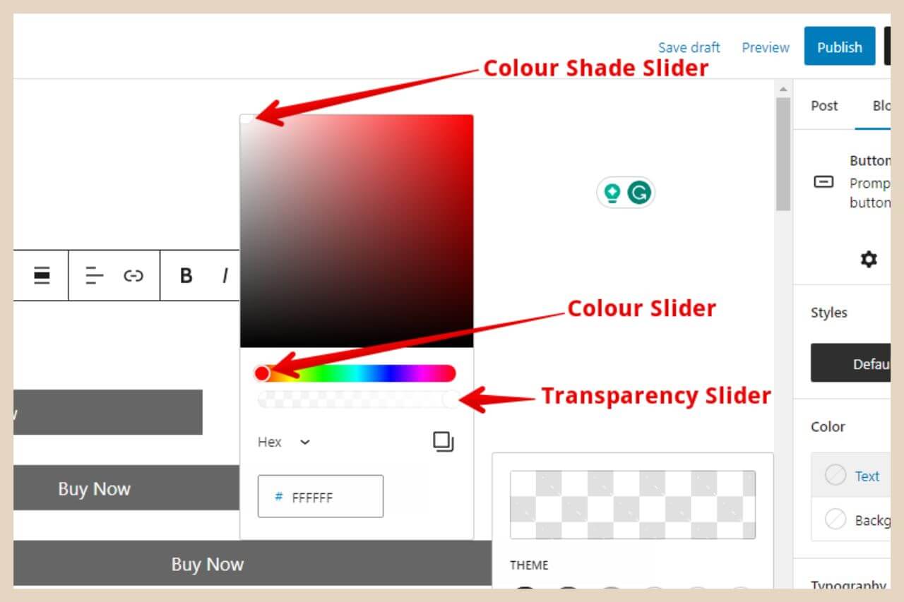
To change the background colour, simply click on the Background button and the same small colour window will appear.
This time, however, you’ll notice two tabs at the top of the box and they are the Solid tab and the Gradient tab.
Using A Solid Colour For Your Button
The Solid tab is the one that will be open by default and it’s exactly the same as the text colour window.
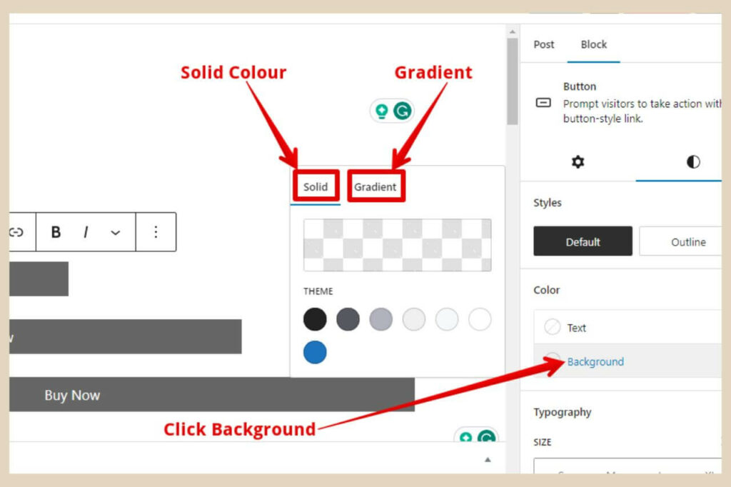
Just like before you can either choose one of the theme colours or you can pick your own solid colour by clicking on the colour box and using the sliders as before.
If you add a background colour to an Outline style button, it will actually add a black border around your button like the image below.
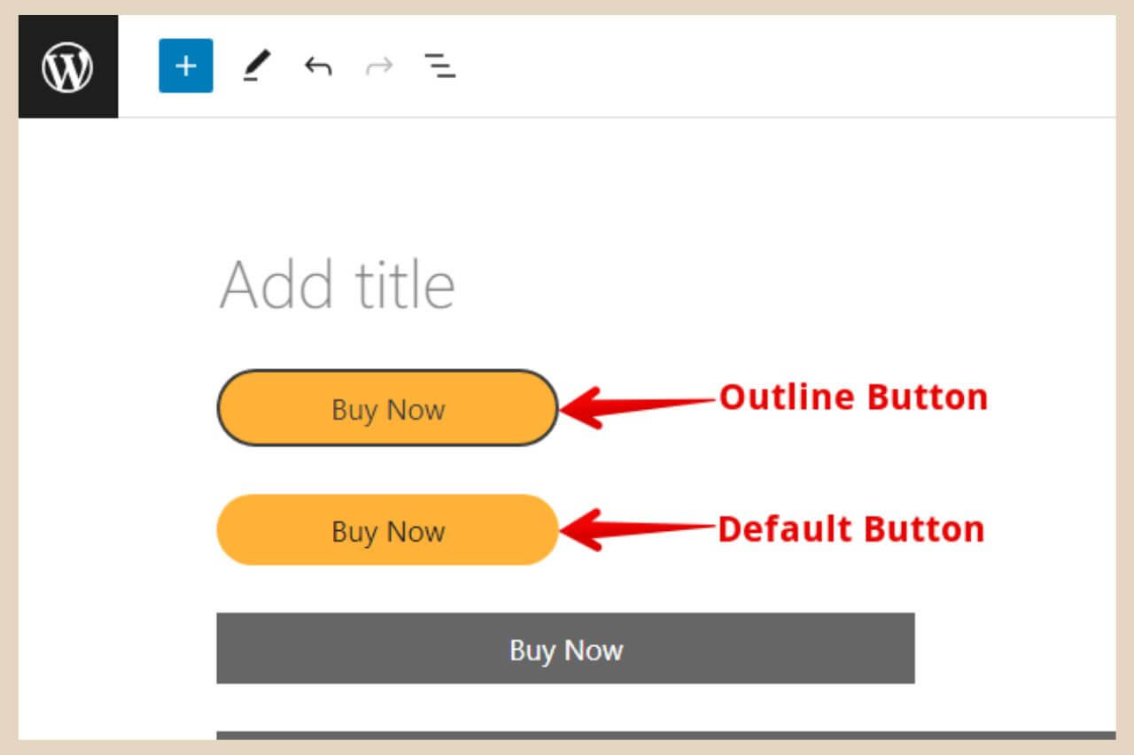
Something I do want to mention here is that whenever you change the default colour of a button, you will lose that hover effect it has by default.
You’ll also notice from the above image that it’s also changed its shape to a button with rounded ends although this is something you can actually change manually at the bottom of the settings section.
So if you don’t like this rounded button change, just scroll to the bottom of the settings to the section called Border.
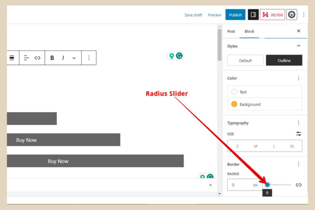
Next, drag the Radius slider all the way to the right, then drag it all the way back again to the left to reset the button back to its straight rectangle shape.
This Radius slider can be used to manually create rounded ends to your button and the slider will adjust the level of the rounded effect.
The second tab is the gradient tab and this lets you use multiple colours that gradually blend and change into each other to create a more colourful button.
Using A Gradient Colour For Your Button
To create a gradient colour, simply click on the Gradient tab and a new small window will appear. At the bottom of the window, there’ll be a selection of preset gradient colours that you can use.
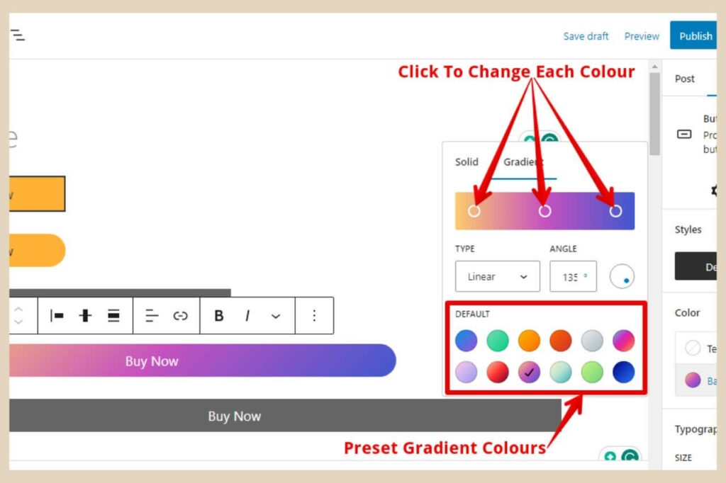
Some of these gradients use two colours and some of them use three. There’s even one there that uses six colours so click on one you like the look of to see how your button looks.
It will change as you play around with the different colours so you can see the effects as you change them. When you click on one of these presets, you’ll see it in the box at the top of the window.
You’ll also notice some white circles within it and these represent the colours used in the preset and you can actually change these by clicking on each circle to create your own gradient colour.
Changing The Preset Colours
To do that, simply click on one of the circles and a brand new colour box window will appear. From here, you can use the sliders to adjust the colour to one of your liking.
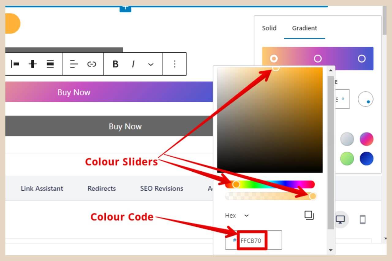
You can then do this with each circle in the gradient preset to change all of the colours to something completely new and unique.
If you’d like to use this exact button colour design again for other buttons then you should make a note of the colour code in the code box at the bottom of each colour window.
This means that the next time you create a button, you can simply type this code into the code box at the bottom of the window to replicate the exact colour design.
You can also turn this button block into a reusable block that you can reuse again and again and I’ll show you how to do that in a moment.
Some Other Changes You Can Make To The Gradient Settings
There are a few more things that you can do here to customise the gradient colours even further. The first one is by using the Type dropdown box and changing the default type Linear to Radial. Linear changes the colours in a line whereas radial changes the colours from the center outwards.
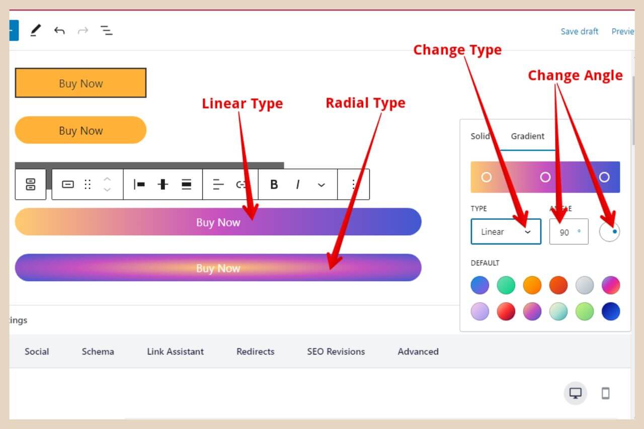
You can also adjust the direction in which the linear type changes colour by using either the Angle box or by clicking and dragging the small blue circle within the white circle which will adjust the direction as you move it around.
If you’d like to add more colours to the preset, you can do that by clicking anywhere in between the current circles that are there.
You notice that if you hover your cursor over the colour box at the top, you’ll see a little + icon like the image below so clicking here will add a new circle to that position.
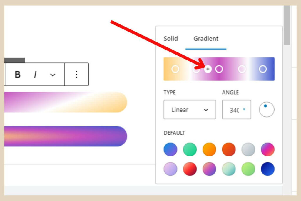
The small colour window will now automatically appear so that you can choose the colour to add here.
All of these colour circles are also moveable too so you can click and drag them closer together or further apart to adjust how much of that colour is in the design.
In the below image, I’ve added two more colours to the gradient (both are white). I’ve also changed the angle by dragging the little blue circle so that it’s in a more diagonal direction and you can see the effect this creates on the button.
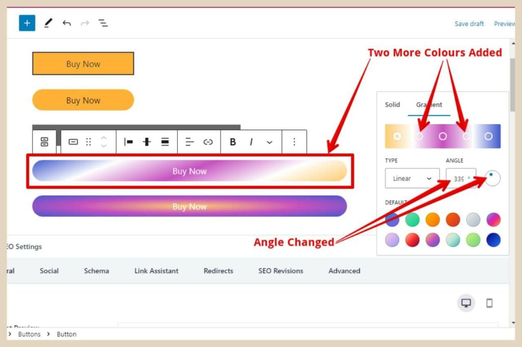
This is definitely an area where you’ll want to play around because you can create some very awesome gradients here.
Changing The Text Style
If you’d like to change the text style, then you can do so by using the Typography section directly beneath the colour section.
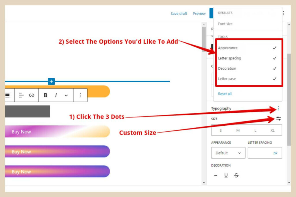
If you click the three dots to the far right of the word Typography, this will open up a small window where you can add some extra options to the typography section.
Font size will already be there by default, but if you click on all the other options, these too will be added so you can make more changes.
You can also choose a custom text size if you’re not happy with the S, M, L, or XL options by clicking on the icon to the far right of the word Size. When the small window appears, you can use the slider to change the text to a custom size of your choice
Adding An Icon/Image To The Button
If you liked to add an icon or image to the button, you can do that by using the small format box that I mentioned earlier.
To do that, simply select the button block and then insert your cursor where you’d like the icon/image to be inserted. Next, click on the dropdown arrow as per the image below and click on the Inline Image option.
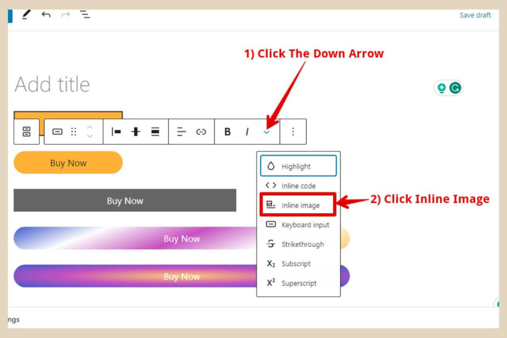
This will now open up your media library where you can select your icon/image of choice or upload a new one and add it to your button.
This icon/image will probably be pretty large when you insert it but you can adjust its size very easily.
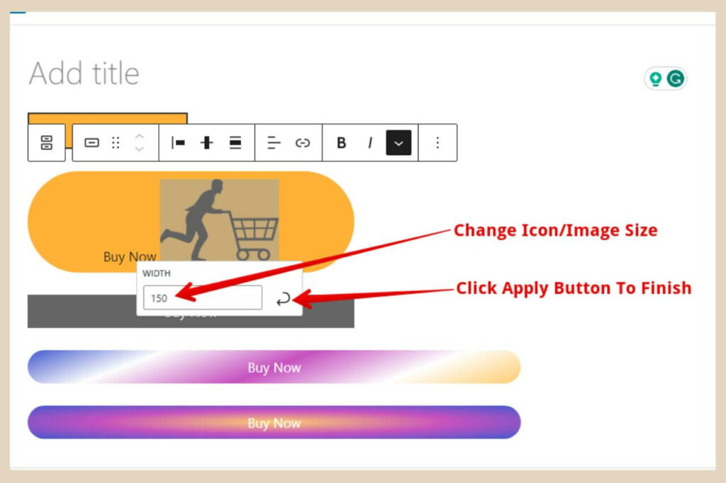
To do that, simply click on the image and change the number in the small width box that appears, then click the apply button to save the changes.
The below image is how the button looks when the icon has been resized.
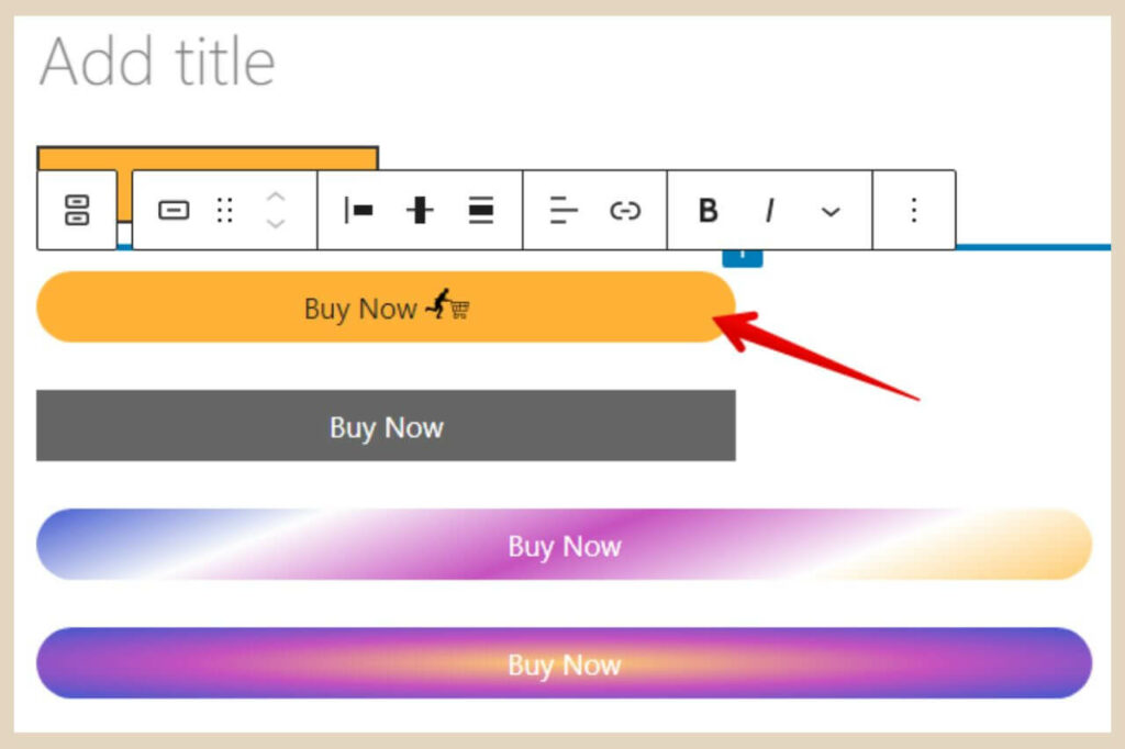
By the way, if you’re wondering where I got that little dude with the shopping cart from, that little puppy came from Pixabay and it was free to use.
Adding A Link To The Button
To add a link to the button, you’ll be using the small format box again only this time, you’ll want to click the link button as per the image below.
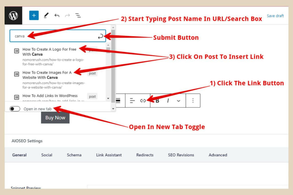
Once you click this link button a new small box will appear. If you’re using this button to link to other posts/pages on your site, simply start typing the post/page name (or an important word in the title) in the search/URL box.
WordPress will bring up a list of your posts/pages that are similar to the words you’ve typed in. In the image above, I typed in Canva and as you can see, this was enough to bring up all the posts I have about Canva.
From here you simply click on the post/page that you want to link to and that’s it (no need to click the Submit button).
The link will be created. You can also use the Open In New Tab toggle if you want to page to open up in a brand new tab.
Adding External Links Or Affiliate Links To Buttons
If you’re linking out to another site or if you’re placing an affiliate link here, just paste the URL or affiliate link into the same search/URL box, click the Open In New Tab toggle if you wish, and then click the Submit button to finish.
For affiliate links, you’ll need to add the word “Sponsored” to the link and to do that, you’ll need to edit the HTML which is actually very easy.
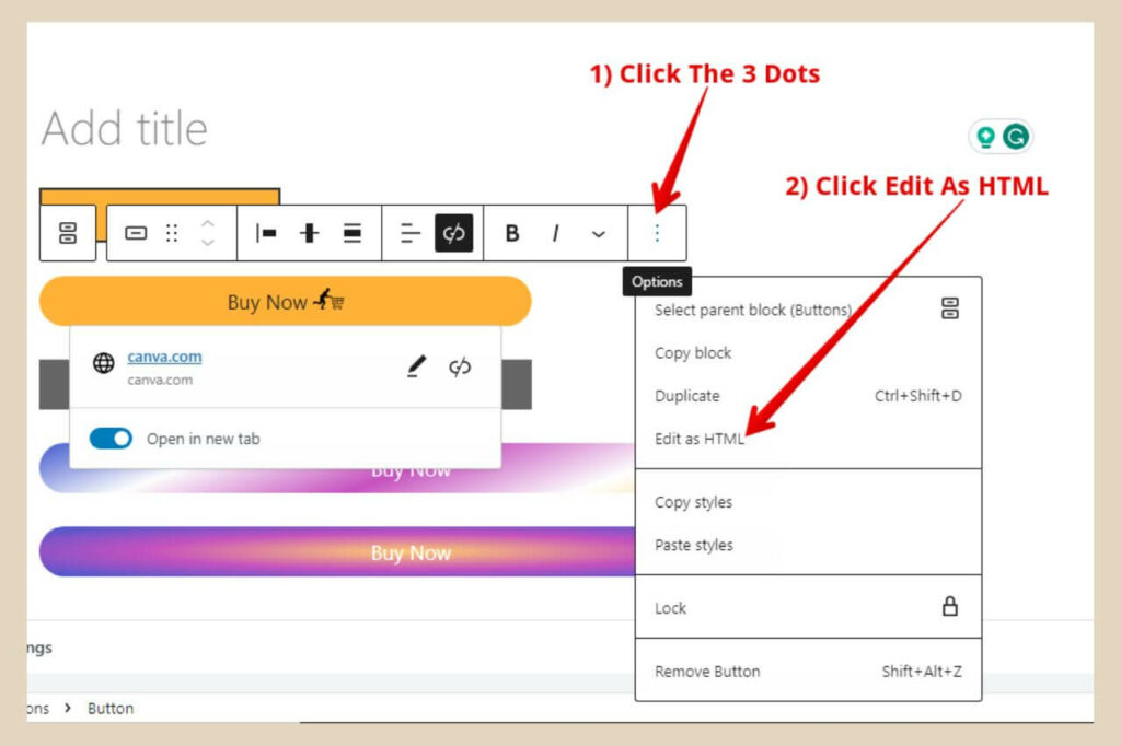
To edit the HTML, you’ll need to click on the three dots at the very end of the small format box. When the new small menu appears, click on the Edit As HTML menu item and this will change the button into HTML code.
If you’re not familiar with code or where to place the word Sponsored, then the easiest way to do this is to click the Open In New Tab option when you create the link.
This will add an extra snippet of code to the link that includes the word “noopener” and this is where you’d place “Sponsored”.
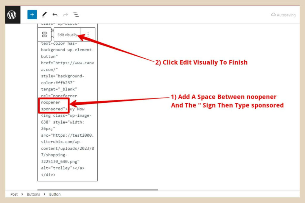
So search for the word noopener and when you find it, place your cursor between the end of the word and the “ sign.
Now use your space bar to create a space and then type in the word sponsored. This section of the link should now look like this – noopener sponsored as per the image above and that’s it.
You can now click the Edit Visually button and that will change the HTML code back to the button.
Creating A Reusable Block
If you want to use this button again and again without needing to rebuild it and customise it every time, you can make your finished button a reusable block.
To do that, you’ll need to click on the first icon on the far left of the small format box and this is the buttons block icon.
Once you click this, the format box will become smaller because now you have selected the buttons block rather than just the button.
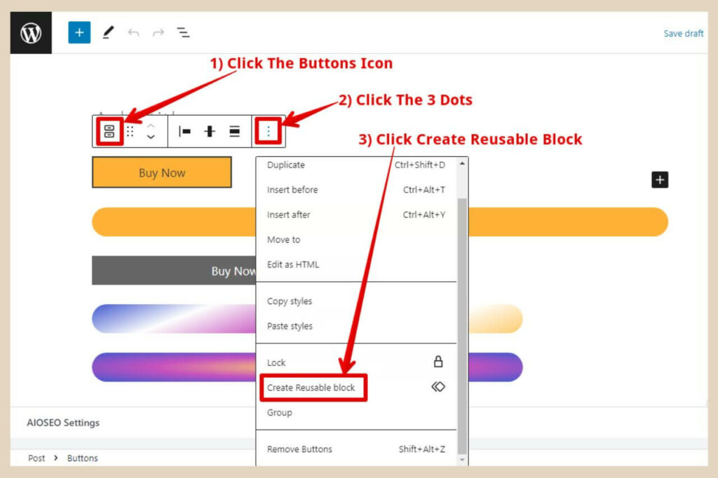
You’ll next need to click on the three dots on the far right of the format box and when the new small menu appears, scroll down until you see the Create Reusable Block menu item.
When you click this, a small window will appear where you can name your reusable block so call it something you’ll remember then click the Save button to finish.
Using Your Reusable Blocks
Anytime you want to use this finished button, you can simply add a new block with the + icon and when the small window appears, you can type in the name of the button into the search box to find it. (See important note below before you make any changes to it)
If you ever forget the name of your button, you can find all of the reusable blocks you’ve created by clicking on the Browse All button at the bottom of the small search window that appears whenever you click the + icon.
This will open up a new section on the left of the page where you can see all of the available blocks.
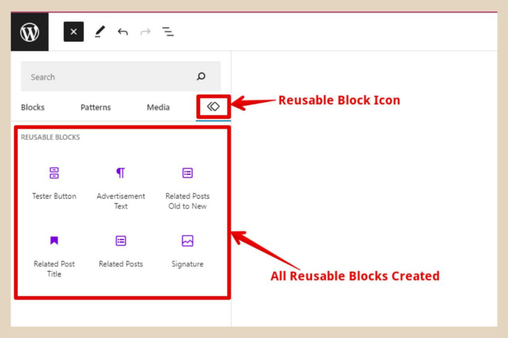
To see your reusable blocks, simply click the reusable block icon on the far right underneath the search box and this will bring you to all of your reusable blocks.
Important Note: Before you make any changes to a reusable block, make sure that you click the Convert To Regular Block button first before doing anything to it.
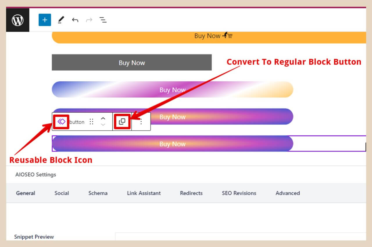
The reason why is that if you make any changes to a reusable block without converting it first, these changes will also take effect on every other instance of that reusable block (I learned this the hard way).
You’re basically updating the reusable block and if you’ve used it on any other posts without converting it, those blocks will also be updated with the new changes. That includes links and all.
And you’ll always be able to distinguish between a reusable block and a regular block because you’ll see the reusable block icon on the far left side of the small format box above it when it’s selected.
Adding More Than One Button Next To Each Other
Let’s imagine that you’re reviewing a product and that you’ve signed up for several affiliate programs that sell this same product.
One company might only ship to one part of the world and the other company might only ship to a different part of the world.
In that instance, because you probably have worldwide traffic coming to your site, you may want to add several buttons to give your readers the opportunity to click on the one that ships to them.
Below is an example of where I did this on one of my other sites for this exact reason.
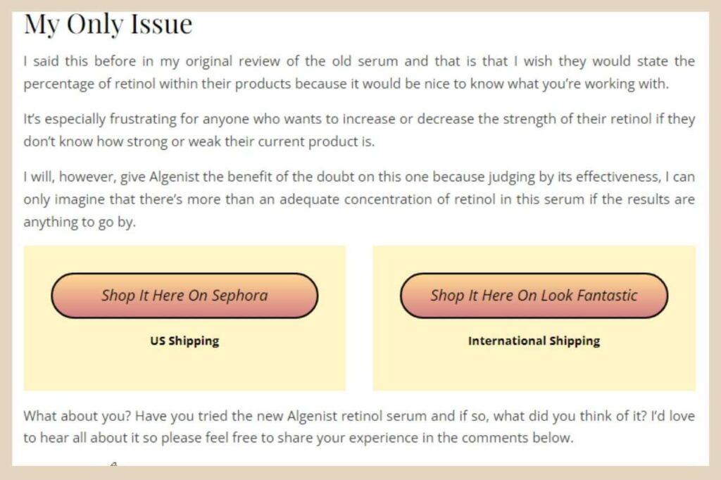
You may just want to give your readers a selection of different places where they can buy the product because one reader may prefer to buy from Amazon whilst another may prefer to buy it direct from the brand website so you’re covering both bases here.
Duplicating A Button
So, there are a couple of ways to do this and the first way is by duplicating the button. To do that, you simply need to click on the three dots on the far right of the small format box when the button is selected.
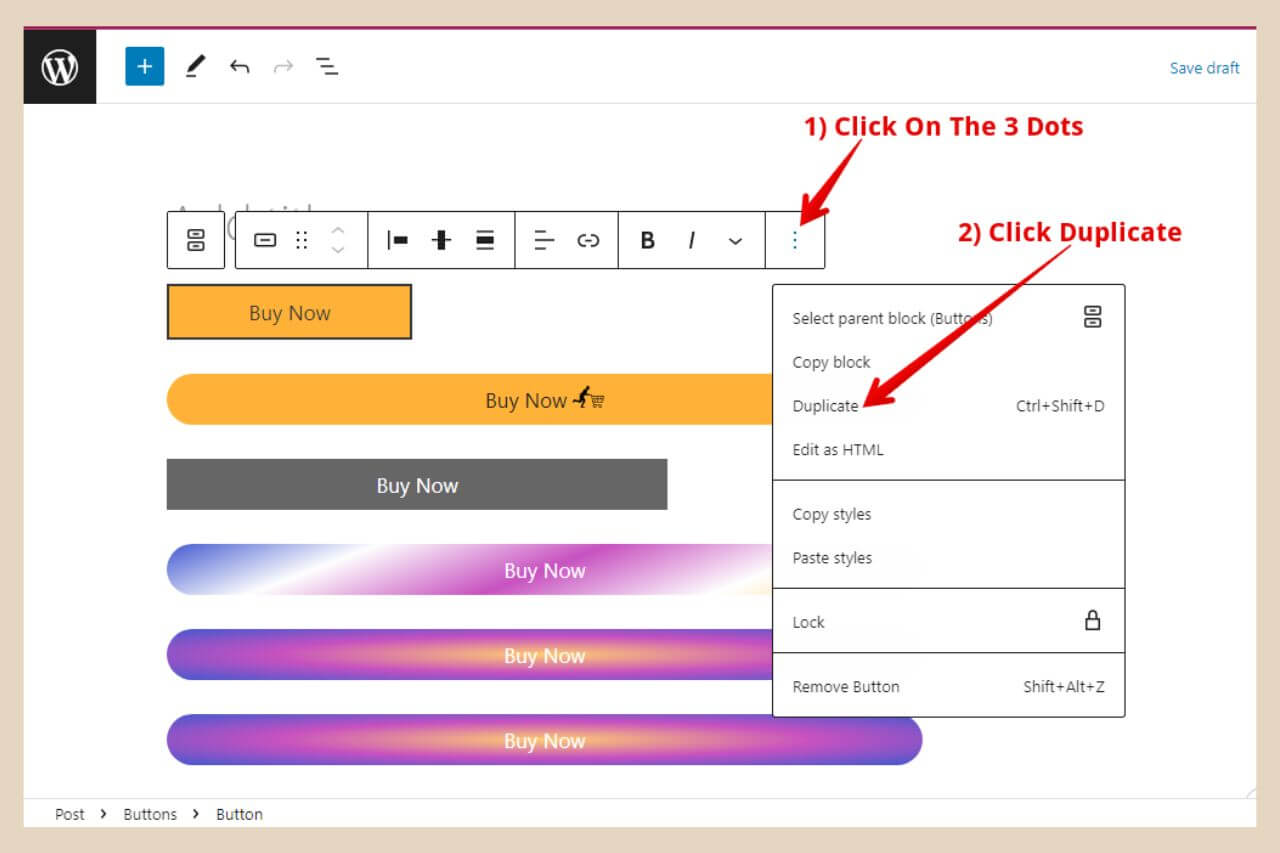
When the new small menu appears, click on the Duplicate menu item and this will insert an identical button right next to the original button (as long as there’s enough room for both buttons on the same line otherwise it will place the button on the line beneath).
Using The Columns Block
If you’d like your buttons to be more evenly spaced out then a better way to do this is to use a Columns block.
To add a columns block, just click the + icon and start typing the word Columns into the search box then click the columns block once it appears.
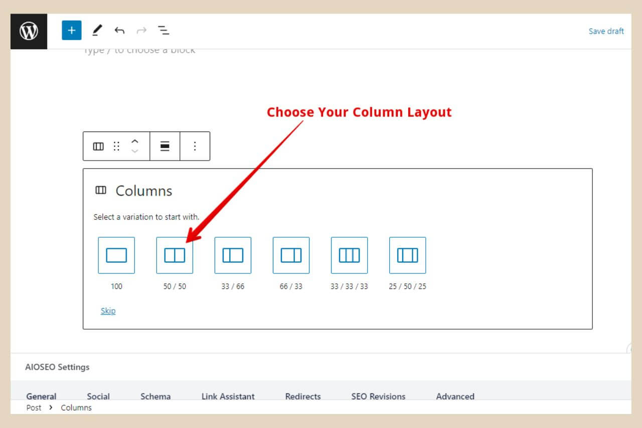
Once you’ve clicked it, a section will appear where you can choose the type of column layout you want as per the image above.
So click the column layout that you’d like to use and this will insert a number of smaller blocks across one line that represents the layout you’ve chosen.
In the below example, I choose two equal-sized columns and as you can see, this inserted two smaller blocks across the same line.
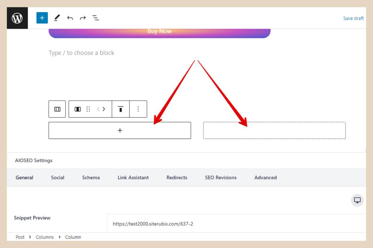
From here, you can simply click one of the blocks and you’ll see the + icon which you can then click to add whatever other block you’d like within it and in this case, a button block.
You can add more blocks underneath the buttons too, like a paragraph block for example, if you wanted some other text below each button as I did with the shipping info in the image earlier.
The below image shows how a two-column block and a three-column look so you can use whichever layout style and size suits your needs.
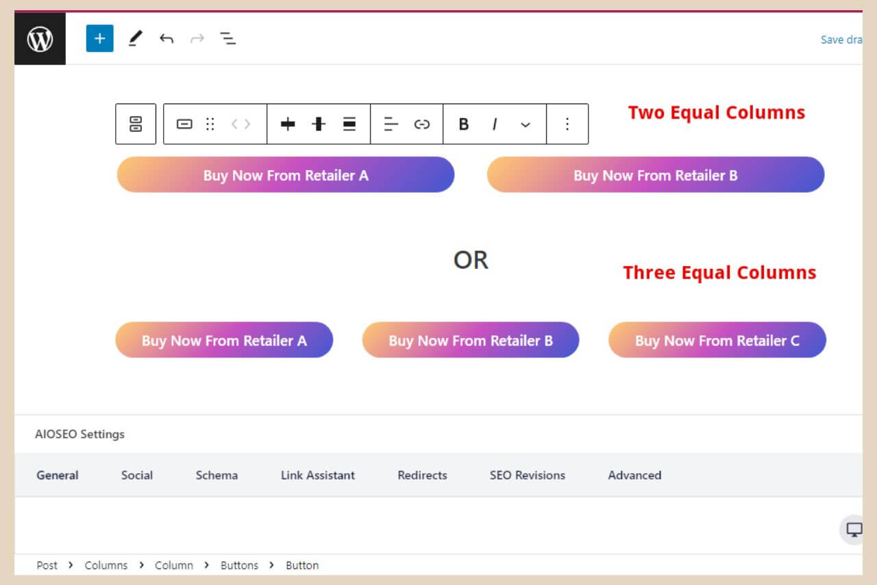
You can now customise each button individually by following all the steps as before and that’s all there is to it. You can do quite a bit more with these columns blocks but that’s for the next tutorial.
Let’s Get Those Buttons Added
As I mentioned at the beginning of this post, you can also use plugins to create even more customisable buttons but who wants to add another plugin right? Not me, that’s for sure.
But if you do want to try a button plugin then MaxButtons is a pretty popular one that you can try however the button block already built-in within WordPress is more than adequate to create simple yet colourful and unique buttons and it’s super easy to do.
I hope you’ve found this tutorial helpful but if you do need any help with anything, please let me know in the comments below and I’ll be more than happy to help you out.
Happy Button Creating!

You May Also Like
- How To Display Recent Posts With Thumbnails In WordPress
- How To Add An Affiliate Disclosure To Your Posts
- What Is Wealthy Affiliate – Everything You Need To Know

