So, you’re starting a blog and you’re staring at that blank canvas wondering, “How do I make this thing look like I know what I’m doing”? Well, don’t worry, you’re not alone. Every new blogger hits this moment of design paralysis, but with a few simple website design tips, you can create a blog that looks polished, trustworthy, and professional right from the start.
Your blog’s design is one of the first things visitors notice, and whether they stay or click away often comes down to that first impression. A clean, user-friendly layout builds trust, improves readability, and makes your content shine.
In this post, I’ll walk you through 7 beginner-friendly website design tips that can instantly upgrade your blog’s look and feel. Whether you’ve just launched your blog or are giving your current one a mini-makeover, these tips will help your site feel like it was built by a pro (even if it was built in your pyjamas).
So, let’s get started.
Tip 1: Keep It Clean and Simple
Clean and simple is the best way when it comes to website design, but many new bloggers get overly excited with their new creation and often feel the need to fill every inch of space. Think pop-ups, flashing banners, too many fonts, and widgets galore.
Too many features or snazzy design aspects can be distracting, which can overwhelm your visitors and make your blog look messy or amateurish.
A cluttered or busy layout makes it hard for readers to focus on your content. Worst-case scenario, it can make your site feel untrustworthy. A clean design, on the other hand, makes your blog feel more professional, easy to navigate, and credible, especially to first-time visitors.
How To Keep it Simple
You don’t need to go nuts and fill every area of website real estate like it’s an unfinished jigsaw puzzle. Just because there’s a blank space there, it doesn’t mean you need to fill it. Instead, think clean, spacious and airy.
- Choose a simple, minimalist blog theme.
- Use 2–3 complementary colours max.
- Stick to 1–2 easy-to-read fonts.
- Leave some white space – don’t be afraid of blank areas!
- Ditch any sidebar clutter that doesn’t serve your reader.
- Avoid excessive animations and flashing graphics.
- Don’t overcrowd your site with unnecessary widgets or flashy features.
Less really is more when it comes to website design. Keep your blog layout clean, simple, and focused so your content can shine and your visitors can breathe.
Tip 2: Use a Professional-Looking Theme
Your theme is one of the first design decisions you’ll make as a new blogger, so choose wisely. A cluttered, outdated, or overly “free-looking” theme can instantly turn visitors off, no matter how great your content is. First impressions matter, and your theme is often the first thing your audience notices.
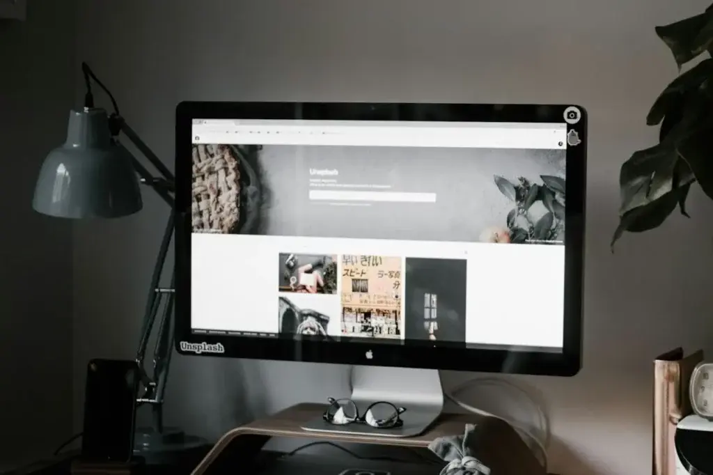
Your theme sets the tone for your entire blog. A clean, modern design helps build credibility, keeps readers engaged longer, and makes your site easier to navigate, which is crucial for user experience and SEO.
What To Look For in a Theme
Seeing as there are many thousands of themes to choose from, you won’t be short of options. But keep the following in mind when making your theme choice.
- Choose a mobile-responsive theme (non-negotiable in 2025).
- Look for themes with clean layouts, clear typography, and fast loading speeds.
- Consider paid themes (like Kadence, Astra, or GeneratePress) if your budget allows. They often come with better customisation, performance, and support (although their free versions are great to get you up and running).
- Customise your theme with your own branding to make it feel unique, even if you’re starting with a common template.
A polished, professional theme sets the stage for everything else. Choose one that’s clean, user-friendly, and aligned with your blog’s goals.
Tip 3: Use Consistent Branding
Consistent branding is very important when it comes to blog design. Too many font styles, clashing colours, or inconsistent designs can make your blog feel chaotic and amateurish. It’s like wearing mismatched socks with a tuxedo; people notice, and not in a good way.
Consistency builds trust and reinforces your brand identity. A clean, cohesive visual style instantly makes your blog feel more polished and professional, even if you’re just starting out.
How To Keep Things Consistent
Find your style and repeat it across your blog and anywhere else you share it. Whether that be colours, fonts, logos, buttons, image shapes and sizes, stick to the same style across your entire brand.
- Choose 1–2 fonts: one for headings and one for body text, then stick with them.
- Pick a simple colour palette (2–3 main colours plus black/white/grey neutrals).
- Use the same colours and fonts across your blog, graphics, social media, and opt-ins.
- Create a basic brand style guide to keep everything aligned as you grow (ie, make a note of your fonts, colours, etc and where you use them).
- Make templates in your design app of choice (Canva, etc) for all your blog image sizes to keep things consistent.
- Create patterns (reusable blocks) for buttons, banners, etc, that you use frequently so that they can be easily duplicated around your site.
You don’t need to be a designer to have a strong brand; you just need to be consistent. A unified look makes your blog instantly more credible and professional.
Tip 4: Prioritise Easy Navigation
Navigation can make or break your blog site, so it’s really important to get it right. If visitors can’t figure out where to go next, they’ll just leave. Confusing menus, hidden pages, or too many navigation options can make your blog feel chaotic and unprofessional.
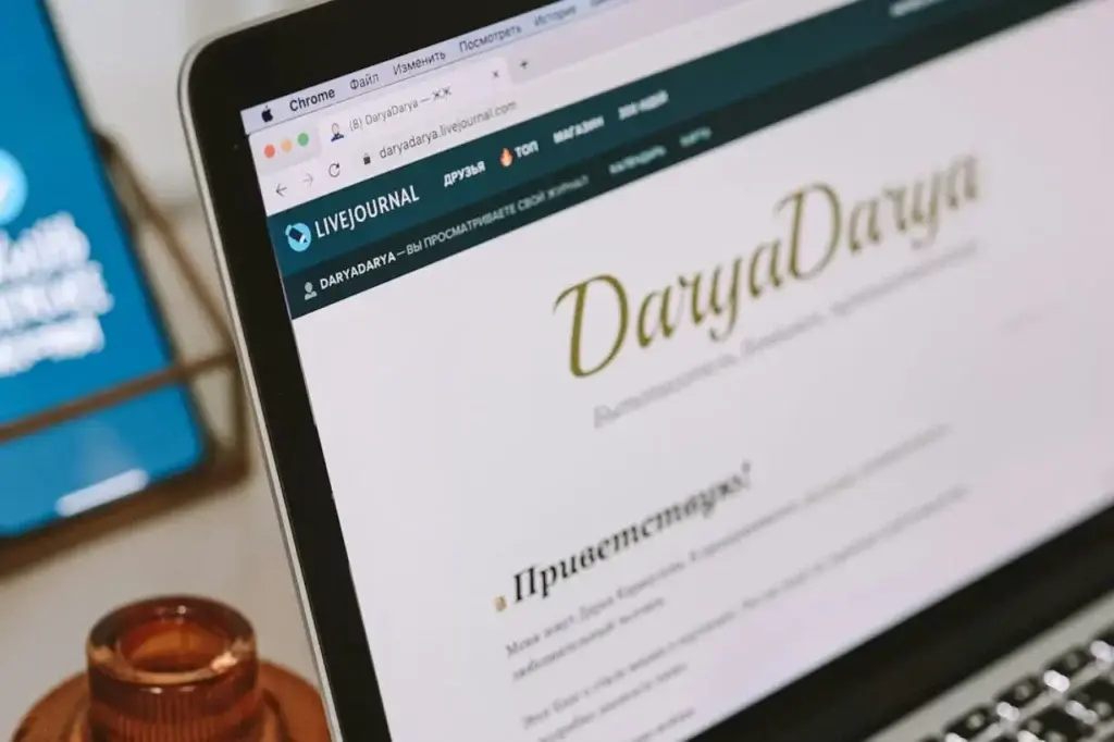
Your navigation is like a map to your entire blog site. If it’s clear and simple, visitors stick around longer, explore more, and are more likely to come back. Plus, clean navigation helps with SEO and site structure, so it’s a win-win all round.
How to Keep Your Menus Simple
Your navigation should be clear and easy to follow. Think about the main topics of your niche or services your site provides and use those to create a main menu. Everything else can be broken down into submenus for easier navigation.
- Stick to a straightforward top menu with 4–6 main links (like Home, Blog, Start Here, etc or broad topics/services relating to your niche).
- Keep your main menu on one line (if it goes into two, then you’ve added too many menu options).
- Use drop-down submenus from your main menu to cover your subtopics.
- Create clear categories to organise your posts and display them in your menu or sidebar (categories are often used for submenus).
- Add a search bar to help people find content fast.
- Make sure your menu looks great on mobile too (responsive design is key).
A professional-looking blog doesn’t just look good, it works well too. Make it easy for your readers to explore your site without getting lost or confused.
Tip 5: Optimise for Mobile Users
With over 60% of website traffic coming from mobile, having a mobile-friendly site is paramount. If your blog looks great on a laptop but turns into a jumbled mess on a phone, you’re losing visitors and you’re losing them fast.
Slow loading, tiny text and awkward buttons are just some of the issues that can arise if you’re site isn’t optimised for mobile. And if that’s what your visitors find when they land on your site, they won’t stick around. Google may also rank it lower in search results, and that means less traffic, fewer readers, and missed opportunities.
How To Optimise For Mobile
Your blog should be just as user-friendly on mobile as it is on desktop, so always ensure that it looks and works just as well on any other device it may be viewed from.
- Use a responsive WordPress theme that adapts to any screen size.
- Check your site on mobile using your own mobile device.
- Check buttons, fonts, and images for readability and ease of use.
- Avoid clutter – small screens need clean, scannable layouts.
- Make sure pop-ups, opt-ins, and menus work properly on mobile.
Design your blog for phones first, not just desktops. If it’s easy to read and navigate on mobile, you’re winning.
Tip 6: Break Up Your Content with White Space & Headings
Nothing scares off readers faster than a giant wall of text. Without clear breaks, paragraphs, or visual structure, even great content can feel overwhelming and uninviting.

Today’s readers skim before they commit. Proper spacing and well-structured headings help guide their eyes, highlight important points, and make your blog easier (and more enjoyable) to read. It also improves accessibility and SEO, so a double win.
How To Break Up Your Content:
You don’t want your blog to look like one long essay, so break it up into bite-sized sections so that your readers will find it easier to consume.
- Use short paragraphs (2–4 lines max) to keep content scannable.
- Add plenty of white space between sections to give the eyes a break.
- Use clear headings and subheadings to organise your content and introduce new ideas.
- Stick to a consistent heading structure (like H2 for main points, H3 for supporting ones).
- Use bulleted or numbered lists to present info clearly and quickly.
- Add images to break up the text and add colour to your post.
A clean, easy-to-skim layout makes your blog feel more polished and user-friendly. Thoughtful spacing and smart headings help readers engage with your content, and actually stick around.
Bonus Tip: Add a table of contents to your blog so that readers can find the information they’re looking for faster. It also highlights the main points in your post, which is great for user experience and SEO.
Tip 7: Use High-Quality Visuals
Images are a great way to break up text and add some colourful visuals to your page, but it’s important that those visuals are high-quality. Blurry images, clashing colours, or generic stock photos can instantly make a blog feel amateur. Poor visuals don’t just hurt your design, they can also damage trust and lower your blog’s perceived value.
Visuals play a huge role in how visitors feel about your site. High-quality, cohesive images can make your blog feel polished, engaging, and trustworthy, even if you’re brand new. Plus, by breaking up text, they improve readability and keep people scrolling.
How To Ensure Your Visuals Are High-Quality:
To ensure your visuals are high-quality, stick to reputable image sites such as Unspash.com, Pixels.com, Pixabay.com or Canva.com. If you’re taking your own snapshots, make sure they’re clear, high-quality images and ensure you optimise them before uploading them to your site.
Self-taken images are usually huge in size and will bring your site to a screaming halt if they’re not optimised first (although you should be optimising every image you upload, not just self-taken ones).
- Use high-resolution images that are optimised for web (small file size, no blur).
- Stick to a cohesive visual style, whether that’s modern, playful, minimalist, or bold.
- Create custom blog graphics using tools like Canva to match your brand colours and fonts.
- Use visuals intentionally – for featured images, Pinterest pins, infographics, and content dividers.
- Don’t overdo it – a few great visuals are better than a dozen random ones.
Strong visuals elevate your blog and help it stand out. Choose or create images that feel aligned with your brand, boost your content, and leave a professional impression.
Final Thoughts: Make Your Blog Feel Like Home From Day One
Design might not be the first thing you think about when starting a blog, but it’s one of the first things your readers notice. Whether you’re trying to grow an audience, build trust, or eventually earn an income, your blog’s design sets the tone from the very beginning.
By choosing a clean, professional-looking theme, using high-quality visuals, keeping things consistent, and structuring your content for readability, you’ll not only look legit, you’ll feel legit too. And when your blog feels like a place people want to hang out, you’re well on your way to turning casual visitors into loyal fans.
Remember: your blog doesn’t have to be perfect, it just has to be thoughtful. Start simple, grow with confidence, and let your design evolve as you do.
And if you need more help or feel like sharing your own design stories, please feel free to drop a comment below. I’d love to hear all about it.
Happy Blog Designing!

You May Also Like
- How to Start a Blog for Free – Beginners Guide
- What to Look for in a Blogging Platform – Beginner’s Guide
- Best Blogging Platforms for Beginners – Free & Paid

